Idea one
ORIGINAL PHOTOS

|

|

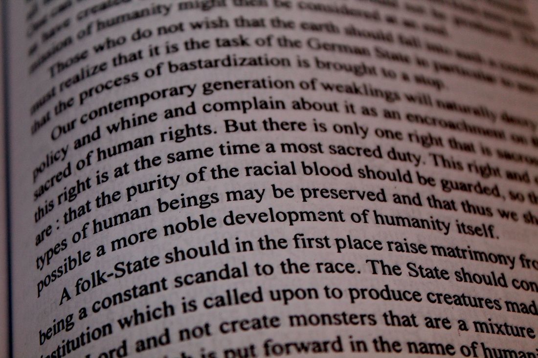
Here is my development for Idea one. I have taken two pictures, one being my model, my brother and two being a book I found in my house. I skim-read through the book to find any keywords that may suit an issue or meaningful words. after taking these pictures, I edited them using Photoshop very minimally. My artist uses text from the Quran and books edited over peoples faces. But mainly religious women with head scarfs etc. I used this style, however, I did not copy it as want to be unique and my own artist. I therefore took photographs of members of my family, behind a plain background and edited the text over their face and facial features such as eyes and mouth. I am pleased with the turnout of this development as it has started of simple. It is simply my brother's face standing towards the lens eyes forward. I like it as the writing is just on his face and not edited poorly, spilling onto the background or his neck. I made my model look quite stern as the text I took was from the book, 'Mein Kampf', by Adolf Hitler. The texts goes on about human rights and uses some strong language. After I flattened the image I used a sepia photo filter to make the overall look more effect. As seen below I have edited the whole picture in some bizarre ways, such as layering three on top of each other, using the invert filter tool and simple black and white. In conclusion I am happy with the quality of my work for development, idea one.


Idea two
ORIGINAL PHOTOS

|
|

Here is my development for Idea two. I have taken two pictures, one being my model, my brother and two being a book I found in my house. I skim-read through the book to find any key words that may suit an issue or meaningful words. after taking these pictures, I edited them using Photoshop very minimally. My artist uses text from the Quran and books edited over peoples faces. But mainly religious women with head scarfs etc. I used this style, however, I did not copy it as want to be unique and my own artist. I therefore took photographs of members of my family, behind a plain background and edited the text over their face and facial features such as eyes and mouth. I am pleased with the turnout of this development as it is very simple. The picture is a close up of my brothers face, mainly focused on his eyes which makes it stand out. I took the open book photograph and layered it onto his eyes. I changed the opacity, and played around with different effects. After I flattened the image I used a sepia photo filter and levels to make the overall look more effect. As seen below I have edited the whole picture in some bizarre ways, such as layering three on top of each other, using the invert filter tool and simple black and white. In conclusion I am happy with the quality of my work for development, idea two.


idea three
ORIGINAL PHOTOS

|

|

Here is my development for Idea three. I have taken two pictures, one being my model, my brother and two being a book I found in my house. I skim-read through the book to find any key words that may suit an issue or meaningful words. after taking these pictures, I edited them using Photoshop very minimally. My artist uses text from the Quran and books edited over peoples faces. But mainly religious women with head scarfs etc. I used this style, however, I did not copy it as want to be unique and my own artist. I therefore took photographs of members of my family, behind a plain background and edited the text over their face and facial features such as eyes and mouth. I am pleased with the turnout of this development as I believe it looks effective. The picture of my brother is of his face, and a wooden pole held in front of him. His eyes are also closed and he looks focussed. My aim was to tell some sort of story through photographs, the way my artist does. But instead of it being religious it could be anything. For example this one is of a man going off to battle, The pole being some sort of weapon. I hope I have achieved my aim through this developed idea. After I flattened the image I used the levels filter to to make the overall look more effective. As seen below I have edited the whole picture in some bizarre ways, such as layering different images on top of each other, using the invert filter tool and simple black and white. In conclusion I am happy with the quality of my work for development, idea three.


Idea four
ORIGINAL PHOTOS

|

|

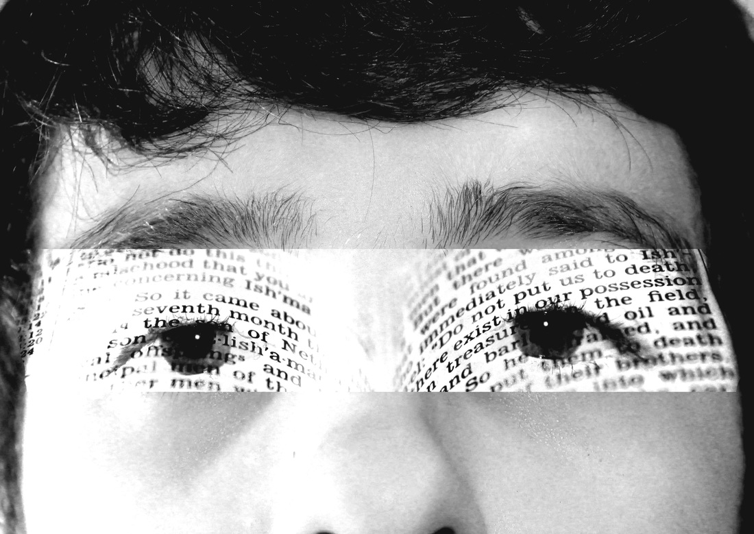
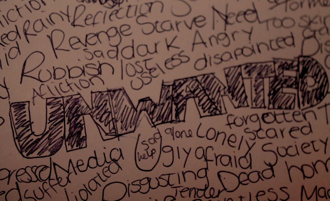
Here is my development for Idea four. I have taken two pictures, one being my model, my brother and two being some writing and meaningful words i wrote down onto a piece of paper. I used the thesaurus to look up interesting words meaning sad, alone, etc. I jotted them down onto a piece of paper and photographed the paper from different angles. After taking these pictures, I edited them using Photoshop very minimally. My artist uses text from the Quran and books edited over peoples faces. But mainly religious women with head scarfs etc. I used this style, however, I did not copy it as want to be unique and my own artist. I therefore took photographs of members of my family, behind a plain background and edited the text over their face and facial features such as eyes and mouth. I am pleased with the turnout of this development as I believe it looks effective. I got my brother to tilt his head slightly, and look ahead of him., with a neutral facial expression. I then got the picture of the writing i did and layered it on top. After I changed the opacity of the writing on his face and flattened the image I used the levels filter to to make the overall look more effective. I also used black and white as i thought it suited the look better. As seen below I have edited the whole picture in some bizarre ways, such as photo filter and invert. In conclusion I am happy with the quality of my work for development, idea four.


Idea five
ORIGINAL PHOTOS
|
|

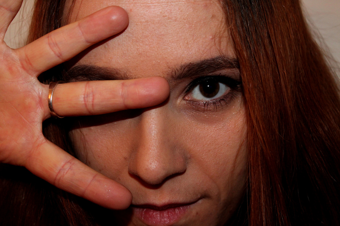
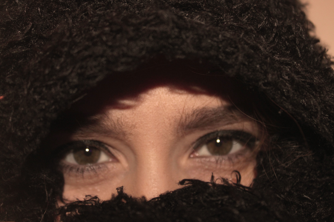
Here is my development for Idea five. I have taken two pictures, one being my model, my sister and two being a book I found in my house. I skim-read through the book to find any keywords that may suit an issue or meaningful words. after taking these pictures, I edited them using Photoshop very minimally. My artist uses text from the Quran and books edited over peoples faces. But mainly religious women with headscarves etc. I used this style, however, I did not copy it as want to be unique and my own artist. I therefore took photographs of members of my family, behind a plain background and edited the text over their face and facial features such as eyes and mouth. I am pleased with the turnout of this development as I believe it looks effective. The photograph is of my sister's full face. I got her to open one hand and place it over her eye, fingers spread out. I got her to look suspicious with her eye glaring on the lens. My aim was to tell some sort of story through photographs, the way my artist does. But instead of it being religious it could be anything. For example this one is of a woman who may of been bullied because of her looks, hence the quote i layered into the middle ' we were born to be real not to be perfect.' I hope I have achieved my aim through this developed idea. After I flattened the image I used a the levels filter to to make the overall look more effect. As seen below I have edited the whole picture in some bizarre ways, such as layering different images on top of each other, using the invert filter tool and simple black and white. In conclusion I am happy with the quality of my work for development, idea five.


Idea six
ORIGINAL PHOTOS
|
|

Here is my development for Idea six. I have taken two pictures, one being my model, my sister and two being some writing and meaningful words i wrote down onto a piece of paper. I used the thesaurus to look up interesting words meaning sad, alone, etc. I jotted them down after taking these pictures, I edited them using Photoshop very minimally. My artist uses text from the Quran and books edited over peoples faces. But mainly religious women with headscarves etc. I used this style, however, I did not copy it as want to be unique and my own artist. I therefore took photographs of members of my family, behind a plain background and edited the text over their face and facial features such as eyes and mouth. I am pleased with the turnout of this development as I believe it looks effective. The photograph is of my sister's eyes, the rest of her face is covered with a scarf. I got her to glare into the camera lens. My aim was to tell some sort of story through photographs, the way my artist does. But instead of it being religious it could be anything. For example this one is of a woman who may of been bullied because of her looks, hence the words 'ugly' and 'useless' placed onto her face. I hope I have achieved my aim through this developed idea. After I flattened the image I used a the levels filter to to make the overall look more effect. As seen below I have edited the whole picture in some bizarre ways, such as layering different images on top of each other, using the invert filter tool and simple black and white. In conclusion I am happy with the quality of my work for development, idea six.


Idea seven
ORIGINAL PHOTOS

|

|

Here is my development for Idea seven. I have taken two pictures, one being my model, my sister and two being a book I found in my house. I skim-read through the book to find any keywords that may suit an issue or meaningful words. After taking these pictures, I edited them using Photoshop very minimally. My artist uses text from the Quran and books edited over peoples faces. But mainly religious women with headscarves etc. I used this style, however, I did not copy it as want to be unique and my own artist. I therefore took photographs of members of my family, behind a plain background and edited the text over their face and facial features such as eyes and mouth. I am pleased with the turnout of this development as I believe it looks effective. The photograph is of my sister's eye and hands covering the rest of her face, I got her to glare into the camera lens. I also took a picture of rain on a window pane and layered it on top of the overall look, which made it looks unique. After I flattened the image I used a the levels filter to to make the overall look more effective . As seen below I have edited the whole picture in some bizarre ways, such as layering different images on top of each other, using the invert filter tool and simple black and white. In conclusion I am happy with the quality of my work for development, idea seven.


Idea eight
ORIGINAL PHOTOS

|
|

Here is my development for Idea eight. I have taken two pictures, one being my model, my sister and two being a book I found in my house. I skim-read through the book to find any keywords that may suit an issue or meaningful words. After taking these pictures, I edited them using Photoshop very minimally. My artist uses text from the Quran and books edited over peoples faces. But mainly religious women with headscarves etc. I used this style, however, I did not copy it as want to be unique and my own artist. I therefore took photographs of members of my family, behind a plain background and edited the text over their face and facial features such as eyes and mouth. I am pleased with the turnout of this development as I believe it looks effective. The photograph is of both my sister's eyes. and hands covering the rest of her face, I got her to glare into the camera lens. I also took a picture of rain on a window pane and layered it on top of the overall look, which made it looks unique. After I flattened the image I used a the levels filter to to make the overall look more effective . As seen below I have edited the whole picture in some bizarre ways, such as layering different images on top of each other, using the invert filter tool and simple black and white. In conclusion I am happy with the quality of my work for development, idea eight. This development is mainly similar to my previous idea, seven, although i still like this one too.


Idea nine
ORIGINAL PHOTOS

|

|

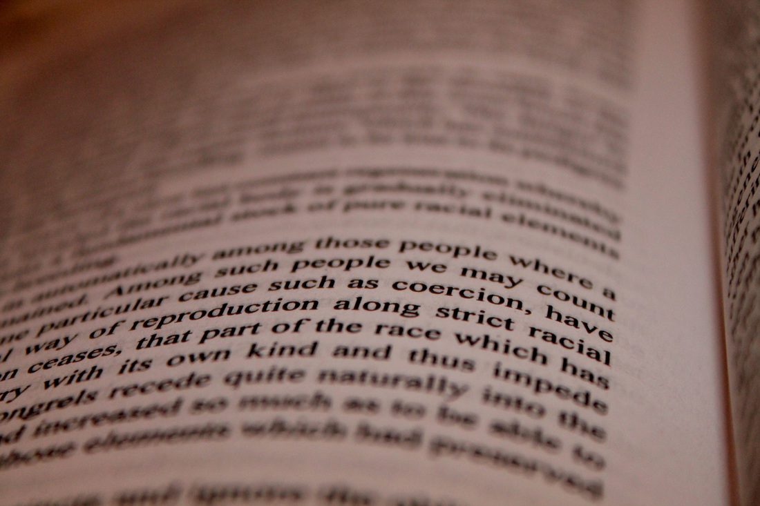
Here is my development for Idea nine. I have taken two pictures, one being my model, my brother and two being a book I found in my house. I skim-read through the book to find any key words that may suit an issue or meaningful words. after taking these pictures, I edited them using Photoshop very minimally. My artist uses text from the Quran and books edited over peoples faces. But mainly religious women with head scarfs etc. I used this style, however, I did not copy it as want to be unique and my own artist. I therefore took photographs of members of my family, behind a plain background and edited the text over their face and facial features such as eyes and mouth. I am pleased with the turnout of this development as it is simple with a strong meaning behind it. It is of my brother's face standing towards the lens eyes forward. His hands are covering his cheeks and forehead, although his eyes are visible, i got him to close them tightly and scream. I didn't get him to pretend as it would have looked fake, therefore i made him scream in reality to create a distressed image. I like it as the writing is just on his face and not edited poorly, spilling onto the background or his neck. The text I took was from the book, 'Mein Kampf', by Adolf Hitler. The texts goes on about human rights and uses some strong language, therefore my model is representing these ideas and anger. After I flattened the image I used a sepia photo filter to make the overall look more effect. As seen below I have edited the whole picture in some bizarre ways, such as using the invert filter tool and simple black and white. In conclusion I am happy with the quality of my work for development, idea nine


Idea ten
ORIGINAL PHOTOS

|

|

Here is my development for Idea ten. I have taken two pictures, one being my model, my sister and two being a book I found in my house. I skim-read through the book to find any key words that may suit an issue or meaningful words. after taking these pictures, I edited them using Photoshop very minimally. My artist uses text from the Quran and books edited over peoples faces. But mainly religious women with head scarfs etc. I used this style, however, I did not copy it as want to be unique and my own artist. I therefore took photographs of members of my family, behind a plain background and edited the text over their face and facial features such as eyes and mouth. I am pleased with the turnout of this development as it is very unique. It is simply my sister's face standing towards the lens eyes looking downwards. I got a galaxy theme and layered it carefully into the background. this makes it looks more effective also. As seen below I have edited the whole picture in some bizarre ways, such as layering three on top of each other, using the invert filter tool and simple black and white. In conclusion I am happy with the quality of my work for development, idea ten.


Final Pieces
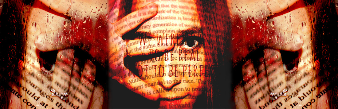
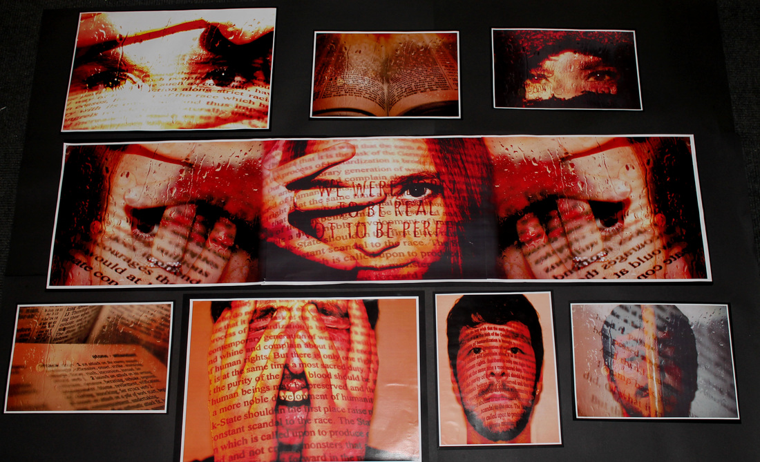
Here is my final development in the style of Shiran Neshat. I have taken many photographs along the way, including ones of books, both my models faces, and writing, done by myself. As seen above, i took two separate photographs from my previous development ideas and put them together on an A3 sheet, i put one in the middle and the other one, into two copies on an A3 sheet but flipped round. These went either side. I then mounted that onto a black piece of card. This went into the middle of my big sheet. This was originally going to be my final, big piece and that would have been it, done and finished. However, i didn't like it too much and thought it would look much more effective if i put some big and smaller pieces around it. I printed out some book developments and original face photographs. They all had the same type of filter on them, a brown tinge which had to be mounted onto a black piece of card. Below is my final piece. I am pleased with the overall look, and have done my best throughout the unit. I have loved doing my work in the style of Shiran Neshat, But i have done it my own way.